COMPOSITION
Other Elements of Composition
In addition to the rule of
thirds, we also have other compositional tools at our disposal.
Some of these rely on the way the viewer's eye is drawn into and across
the image, while others make use of what we could call aspects of
perspective. We can also make use of the colours and tones of light
available to achieve the compositional effect we are after. Remember that
we are striving for that "wow" factor, so anything that
can generate it is
grist to our mill!
Once again, the point is best made graphically, so look at the image
below:
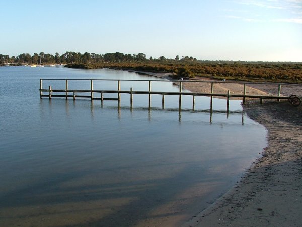
Yes, it's our tranquil jetty scene again. Why does this photo convey such a sense of serenity? Certainly because of the calmness of the water, yes, and the clarity of the sky, the absence of any element that indicates movement... anything else? Ask yourself what it feels like to look at the image. What happens to your eyes when you look at this photo?
Now look what the next image indicates...
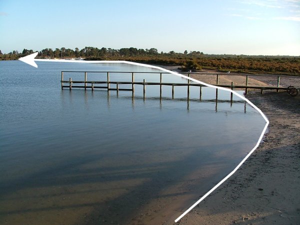
The arrowed line shows the "route" our eyes take across the image. It is a gentle curve (well, marred only by my inability to make it smoother!) with no deviations. The shoreline leads the eye across the whole of the scene, and as the eye travels along this curve, we pick up the other essential details.
Sometimes we do not wish to convey a sense of serenity, or our subject requires a different approach, as in the image below:
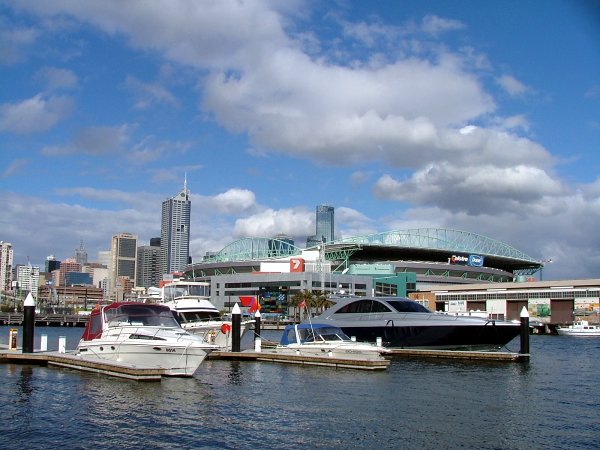
Here we have a busy cityscape, and the photograph tries to convey the vibrancy and the dynamics of the scene. What we need in such a case, is to lead the viewer's eyes on a different path. The lines should be quite obvious to you by now, so see if you can find them before looking at the next image...

Did you find both lines? See how the lower line leads to where the one following the clouds meet the horizon, so that no matter whether we start looking at the photo from the foreground or from the sky, our eyes are drawn across the image along the line of the buildings. Notice also that the centre line of the buildings (somewhere just below the red 7) lies on the lower third line of our grid. Here the movement is busier, and so we experience the photograph as more dynamic, more typical of a city scene.
There is another compositional element ( a line, if you want) in this image that I have not indicated. Can you see it? It deals with colour, and we shall discuss that in more detail later... Well, what is it? If you pointed out the positioning of the three red areas in the image you are right, well done! There is the red buoy on the boat second from left, the part of the large red 7, and the small red 7 on the grey building, all leading the eye to a landmark of Melbourne, the Rialto Tower, the tall blue building in the background (it is the tallest office building in the southern hemisphere, by the way).
The next compositional aspect we are going to look at is perspective. Most of what we understand by perspective is also determined by the "lines of sight" or "leading lines" we can discern in a photograph. We all know that by perspective we refer to the fact that objects seem smaller the farther they are from us, but there is a different kind of perspective that is often used with great success in landscape photography. It is called aerial perspective. Look at the image below by Tony Richardson:
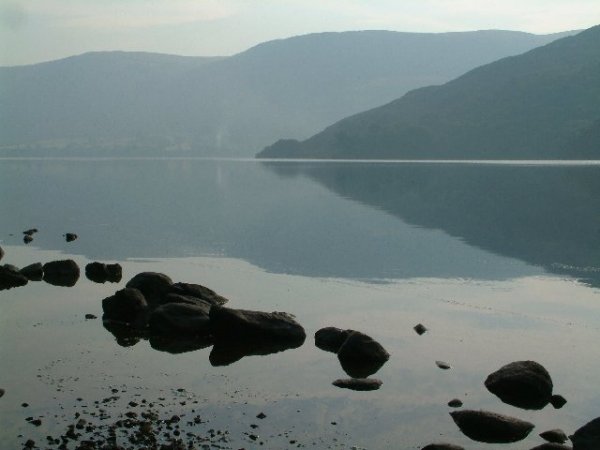
Notice how the mountains get "lighter" in the distance? That is aerial perspective. You can trace out for yourself the leading lines in this image. They are fairly complex, and because of that the image leaves us with a faint sense of unease, as though we sense that all is not as tranquil as it seems. A different point of view, or merely raising or lowering the camera, would have produced a very different image. Try it for yourself: copy this photo, and then in whatever program you use, PSP or Photoshop or whatever, crop it in various ways and see what the results are... Have fun!
Our next image is one I like very much, and it works to show how a good photographer can both use and break the "rules" to great effect. (No, it is not one of mine! It is another Richardson image)
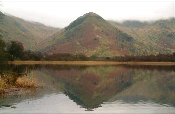
A striking photograph, is it not? And yet it breaks so many rules! The shoreline is almost dead in the middle of the frame, the hill is in the centre of the frame, and the hill and its reflection form a closed diamond shape in the centre of the image, all things that would drive your average photo club judge to drink and hysterics! So why on earth does it work? Before I tell you, try and work it out for yourself. Hell, you can even sneak a peek at the next image if you want!
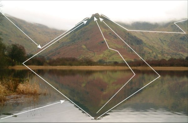
See how the lines run all over the place? But where do they all eventually lead our eyes? You can draw quite a few more, if you like, but they will all eventually take your eyes to the summit of the hill. My feeling is that this image works because of the colours used, the use of the reflection as an compositional element, and it is striking for the very reason that it breaks the rules!