THE BASICS
What makes a photograph good?
Anyone who has ever entered
a photograph for a competition of any kind will know that judges have
their sets of rules or criteria by which they judge images. What we are
going to discuss here are not these rules/criteria, as they tend to vary
from judge to judge, and also because some clubs have their own pet
in-house rules which often become set in concrete!
Rather, I will guide you through the most common elements of composition,
use of light and colour, format and in-camera effects, using photographs
to illustrate each point as we go along. Following these guidelines will,
I hope, enable you to put some more thought into your image making (which
is just a fancy way to say "taking photographs!), and that in turn
should, we hope, help you to produce photographs that will please you and
those who view them.
A word about camera formats here: These pages are primarily aimed at people who use digital cameras, but everything applies equally to 35 mm or other camera formats. Obviously some effects and settings are not available in more basic cameras, but that we will discuss in the section on Choosing Your Camera.
So what is it, exactly, that makes a photograph "good"? The answer, very simply, is that it must have a "wow" effect -- in other words it must please, tease or intrigue the eye of the viewer. Look at the image below:
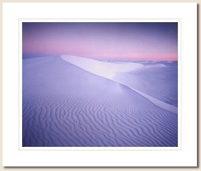
There can be little doubt
that this image (photographer unknown) is extremely striking. It is one of
those photographs that one can look at over and over, and always find
something new of interest in.
The elements that constitute this "wow" effect are basically the
following:
-
Composition
-
The use of focus
-
The use of light
-
The use of colour
Now let us like at these
elements individually...
COMPOSITION
The "rules" of composition are age-old, and have come down to us with the art of painting, and have therefore developed as the trends and innovations in painting developed. This correspondence between photography and painting is an important one, so keep that in mind. Of course, as I have said before and will repeat every now and then, rules are made to be broken, but breaking them successfully is something you can only do once you have mastered them.
The rule of thirds
From the Ancient Greeks we inherited the concept of the Golden Mean, into
which we won't go here and now, but it plays a very important
role in composing our images. It has come to determine the actual ratio of
our prints' length and width (6x8 in., for example, or 100x150 mm), but
more; it provides us with a handy framework for placing the elements in
our photographs when we compose our shots.
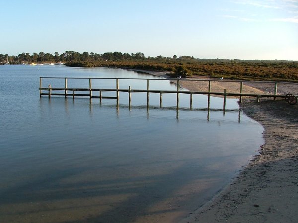
Look at the next image (one of mine):
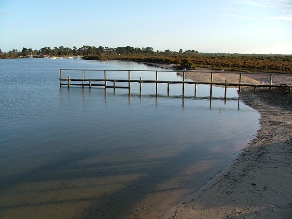
At a first glance it seems a fair enough photo... but if we crop it ever so slightly...
Not much of a change, is there? But look what happens if we superimpose our golden mean grid on both images:
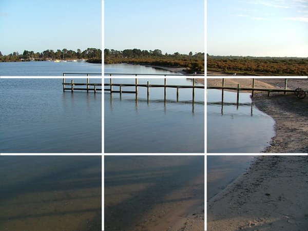
and
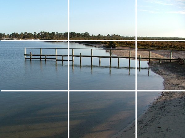
I have chosen these images
to show you how one uses this grid. In the case of the second photo the
grid is still not used to its optimum -- ideally the main point of interest
of the image should lie on one of the grid intersections. The best we have
here is the horizon line moving closer to the top third line and the end
of the jetty now lies closer to an intersection. (That this image, even in
its first version, has some impact, is because of other factors, both
compositional and otherwise, but we'll get back to that at a later
stage..).
Let's have a look at another of my photographs (I use my own as far as
possible, because then I don't hurt anyone's feelings, see?!):
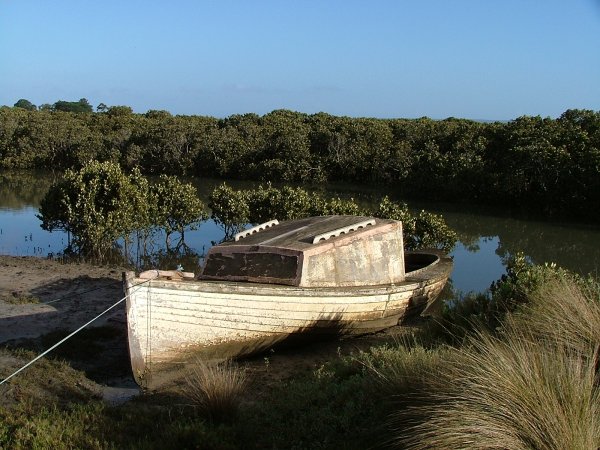
"Mmmm," you
say, "it's OK, but....". Yes, I agree with you. See if you can
pinpoint the weaknesses in the composition of this image, as far as the
use of our grid is concerned.
Found them? Have a look at what the grid shows...
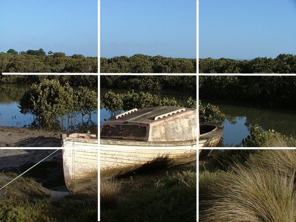
Not too shabby, eh? But the boat (clearly the main interest in the image) lies slap bang in the middle of the photo. The arrangement of the mangroves behind the boat does not allow for a different point of view, unless one gets one's feet wet! Also, the water and mangroves form a kind of barrier to our glance; the eye follows the painter to the bows of the boat, then along it to the water... and that's it! Now see what happens when we crop the image...
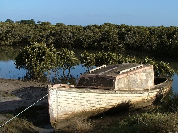
Better? By moving the boat more to the right and down, we have cut out the distracting clump of grass on the right, and also now the eye seems to want to follow the mangroves out of the frame to the left...
What does the grid show now?
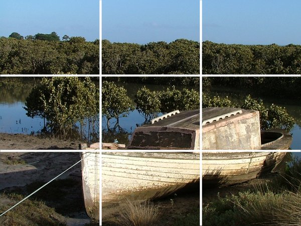
See? The boat's bow now lies on one intersection, its centre on another, and the mangrove line runs along the top third line.
This, then, is how we can use the grid of thirds to improve or check our composition. Can't do it on the spot because you don't want to get your Gucci's wet? There is NO EARTHLY reason why you should not do it afterwards, either in the darkroom or by using a digital image tool like Paintshop Pro or Photoshop! Remember that cropping and any other manipulation performed afterwards is still part of the creative process of photography, and as long as you do it, or it is done by a photo lab to your specifications it is valid, and nothing to be hushed up!